Project 1: Logo Design - Denmark Tourism
I started my process by gathering photo reference and general color schemes that seem to represent the environment and culture that is Denmark.

I then created a mind map of maybe what small details were hidden within the country, branching out into the culture and architecture.

After playing around with various sketches and color palettes, I thought I had decided on what direction I wanted to go for my logo; however, they were all just too busy.


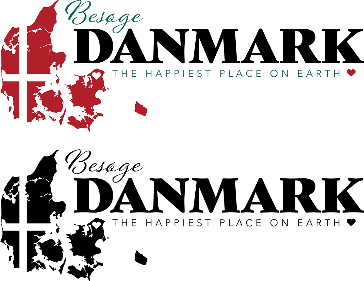
I ended up completely scrapping the original colors, they just weren't working together like I needed them to and made the logo busier than it needed to be. I got a really good idea while browsing some cool fonts that seemed to really fit the aesthetic and theme of Denmark; Here are a few screenshots of my process building the new logo from a vectorized map I brought in from Free Vector Maps.


I made good use of some of Illustrator's tools that I'm not all too familiar with; shape builder, the pathfinder panel, and even the Pantone swatch library. Definitely a good bit of trial and error, as I am used to working in raster based programs like Procreate and Photoshop. The Adobe font library was also incredibly useful, as I was able to obtain entire font families that worked together, rather than going out and trying to find a free font to use from another website. One of the fonts I found was this really regal yet modern font called Gastromond, which has a good visual weight to make the type look more interesting. It also has that calligraphic feel to it that is associated with older media, such as fairytales, castles, and hand lettering.
The three redesigns I ended up choosing between were the ones pictured below, with the very end choice being the one in the middle. I had some trouble adjusting to the visual imbalance that exists due to the extra island to the right of the mainlands, however, this could also be seen as a good opportunity to mold it around certain other design elements in the website.

It ended up needing just one more color for the assignment, so I added a nice tame green that compliments the red, as well as adds some natural feel to it. The finals were rendered with Process, as well as Spot Pantone global colors.